THE NORTH FACE HOME PAGE
A homepage redesign built around a new visual direction, cleaner, more minimal, and rooted in research.
Before designing, I looked at how key competitors were structuring their homepages, content hierarchy, component patterns, what came first. The research confirmed a consistent industry structure, so the focus went on the visual layer: more whitespace, less color, letting the photography lead.
User research helped narrow down which components made it into the final page. I explored multiple variations for every component, hero, banners, grids, cards, carousels, and presented two directions to a senior stakeholder group including the brand's creative director, marketing director, and UX manager.
They chose the cleaner version. The designs went live and were in production for several months.
My role
Visual and UI design
Competitor research
Component exploration
Senior stakeholder presentation
Highlights
RESEARCH BEFORE DESIGN.
Competitor research and user testing both shaped the work, one confirmed the structure, the other helped choose the components.
STAKEHOLDER ALIGMENT.
I presented two distinct concepts to senior brand and UX stakeholders. The presentation moved quickly to alignment with minimal revisions.
EVERY COMPONENT EXPLORED.
Multiple variations for each element on the page, nothing was a first-pass decision.
BEFORE
AFTER


BEFORE

AFTER

Home page components
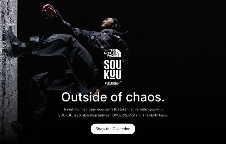
The home page consists of a hero banner, content banners,
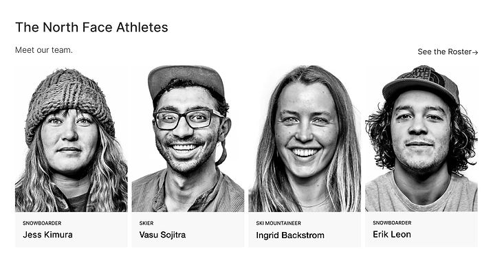
cards, and product grids; each component has multiple variants.
BANNERS


Hero 1

Hero 2

Banner 1

Banner 2
CARDS


One Image

Two Images

Three Images
Four Images
GRID


Five Images

Six Images